A wedding color palette generator can help you sort through color ideas, but your wedding still needs a point of view. You approve the champagne bridesmaid dresses on Monday, save ivory-and-blush florals on Tuesday, and choose linen, invitation, and lighting references by Friday. Each looks beautiful alone. Then you place them together and see five attractive decisions with no shared direction.
Most couples don't have a color inspiration problem. They have a translation problem. A generator can suggest swatches, but it can't decide whether your Miami ballroom needs candlelit amber, cool architectural light, matte linen, or flowers that soften the room without repeating every shade. That work connects color to materials, production, and guest-facing details.
“Let’s try a wedding color palette generator” is a sensible starting point, not the finished design. Prim Miami connects creative direction, floral installations, set and lighting design, stationery, rentals, and vendor management. This guide shows what happens next: how to turn generated colors into coordinated wedding decisions across South Florida, the Caribbean, or Mexico, using a clear event design brief when the choices need to reach your production team.
A Palette Is Only Useful When It Controls the Guest Experience
A generator gives you swatches, not a finished wedding. A champagne tone on your screen may read beige in linen, yellow in warm ballroom light, or nearly white beside ivory stationery. If each vendor approves a different interpretation, the ceremony, reception, and guest-facing details can feel fragmented rather than intentionally layered. For a practical look at coordinating visual details, see Prim Miami's event design and production guide.
Keyword research records 1,600 monthly searches for “wedding color palette generator,” according to the supplied search research. That shows active interest in the starting point. The useful question is whether your palette survives translation into fabric, flowers, paper, architecture, and light.
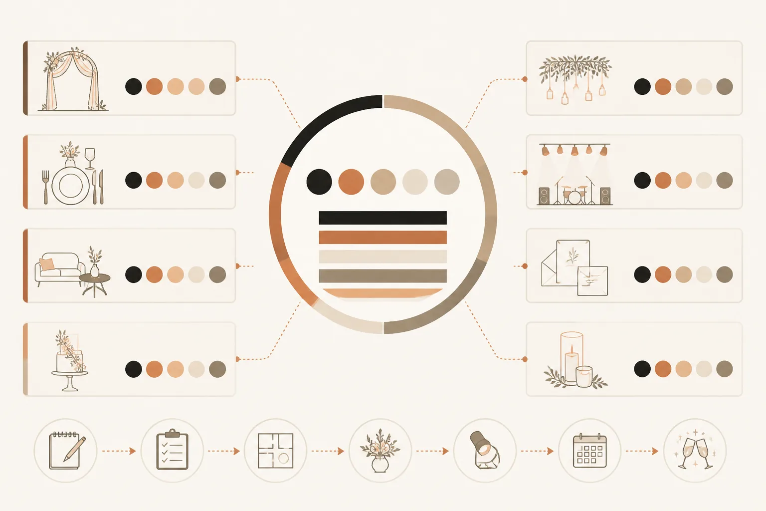
What goes wrong when every vendor interprets the palette alone
Flowers, rentals, stationery, and lighting each translate color differently. A blush bloom may lean peach under Miami daylight, while a blush napkin appears gray beneath cool uplighting. Colors also shift across screens, fabric, flowers, and venue lighting.
“A palette controls the guest experience only when it controls decisions,” according to the production principle supplied for this section.
Without assigned roles, you may approve ivory linens, blush florals, champagne chairs, and amber light as separate wins. Together, they can erase contrast and make the room look washed out. Prim Miami brings floral installations, set and lighting design, and vendor management into the same production conversation.
The 60-second role rule for dominant, supporting, and accent colors
Before you approve any rental, floral, stationery, or lighting choice, give every color one job. Your dominant color carries the largest visual area, your supporting color builds depth, and your accent color appears sparingly where you want attention.
Practical rule: Assign every generated color a role before you approve a vendor or rental choice.
Weak example: “Use the palette for the ballroom.”
Strong example: “Use warm ivory as the dominant linen and stationery base, muted terracotta for floral depth and napkin detail, and coral as the accent on escort cards and candlelight.” That brief gives your florist, rental partner, stationer, and lighting designer the same control system. Your palette then guides the guest experience from first arrival to last light.
Prepare One Visual Reference Before You Generate Anything
A polished-looking palette can still belong nowhere in your wedding. A phone photo may exaggerate coral, while ballroom lighting can turn ivory yellow. Your first input determines whether the generator reflects your venue or invents a separate visual world.
Before you open the generator, decide what you already know, what your guests will see, and how your flowers should feel. One useful reference gives you a better starting point than several disconnected options.
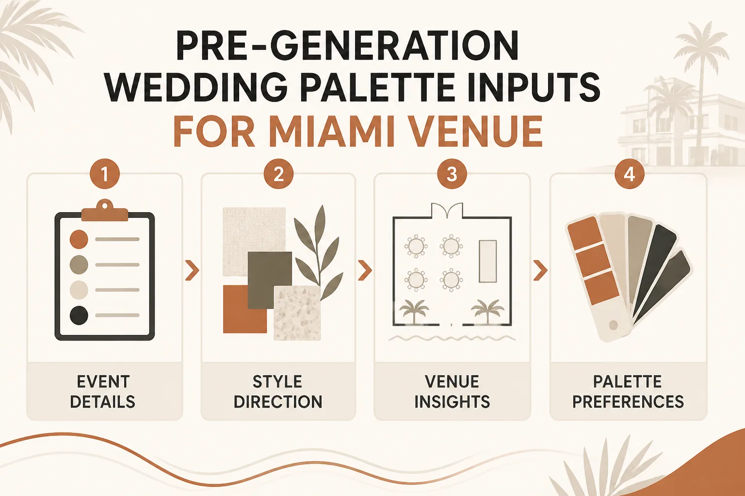
How do you choose the right input route
Use the route that matches the information you have in hand. Choose one venue or fabric photograph for a photo-based generator, a defined mood for a quiz, or a small set of preferred colors for a free generator.
Weak example: “Use a wedding quiz and choose elegant.”
Strong example: “Use a quiz with the mood ‘sun-washed, tailored, and quietly tropical’ for a February garden reception in Coral Gables.”
What venue, fabric, and lighting references do you need
- Input image: Choose one clear photograph of your ballroom, ceremony fabric, or linen, without heavy filters.
- Viewing conditions: Record whether you’ll see the design in strong daylight, beside the ocean, in a garden, or under ballroom lighting.
- Floral direction: Define whether your flowers should feel airy, sculptural, lush, tropical, or restrained.
- Preferred colors: Limit your starting choices to a small group, such as warm ivory, muted terracotta, and coral.
That context matters more than generic seasonal color advice. If you’re building a floral brief, the floral installation guide fits the same workflow. Prim Miami can carry the reference into broader creative direction and production planning, while the generator remains a starting tool.
How many colors should you use while testing a palette
Keep the working palette to five colors or fewer while you test it against linens, stationery, lighting, and flowers. You’ll see relationships more clearly, and you won't ask every vendor to interpret a sprawling screen of swatches.
Weak example: “Save every shade the generator suggests.”
Strong example: “Keep warm ivory, sand, dusty peach, palm green, and deep espresso for the first design review.”
Prepare one visual reference first. Generate multiple options only after that reference reflects your actual South Florida setting.
Generate, Assign, and Test the Palette Across the Wedding Design
A generator gives you options, not a production specification. Move from screen swatches to decisions your florist, rental team, stationer, lighting designer, and venue can execute without guessing.
The sequence below keeps the palette tied to the guest experience. You’re testing how colors behave together, not collecting attractive digital combinations.
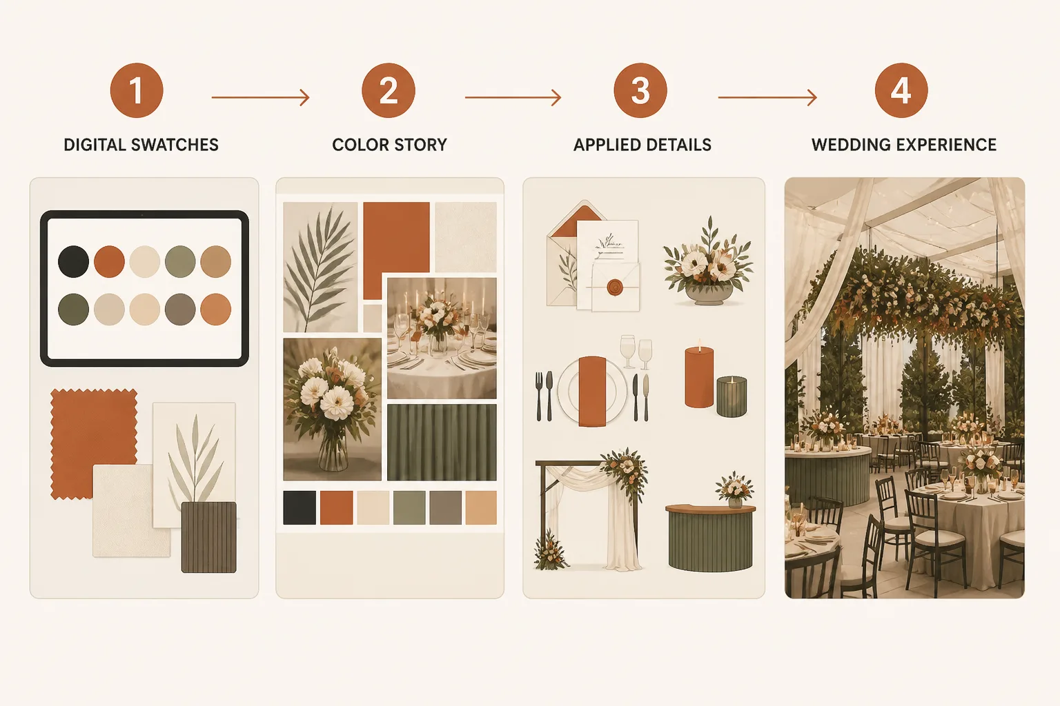
Generate three directions instead of accepting the first result
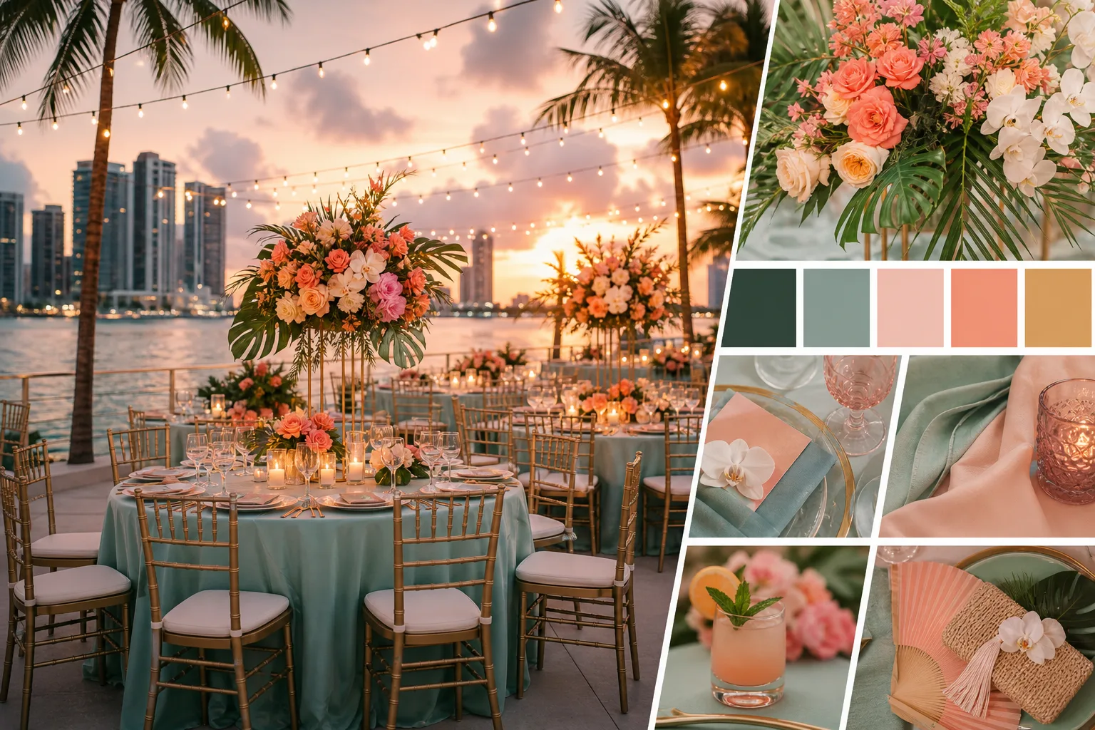
Generate three distinct options from your reference image. Reject any palette that fights your venue, season, or intended atmosphere. A waterfront Miami ceremony may suit sand, warm ivory, and palm green, while a candlelit ballroom may need deeper supporting tones.
Done looks like one selected direction with a clear reason. Failure looks like choosing the first elegant screen result without checking the room.
Assign one job to every color
Give each shade a role: dominant, supporting, or accent. Your dominant color should appear across major visual surfaces, your supporting color should build depth, and your accent should stay selective.
Weak example: “Use champagne, blush, green, and blue everywhere.”
Strong example: Use warm ivory for linens, dusty peach for flowers, palm green for stationery details, and espresso for menus and candleholders.
Translate the palette into florals, lighting, linens, and stationery
Assign each color to florals, linens, stationery, lighting, and guest-facing details. You might use peach in roses, ivory in napkins, green in escort-card printing, and espresso in menus. Lighting should support those choices, not recolor them.
Prim Miami carries this translation through creative direction, floral installations, set and lighting design, vendor management, and destination production. Venue samples still determine the final color behavior.
Test the finished combination under venue conditions
Place linen, floral, paper, and lighting samples in the ceremony and reception spaces. Check them in daylight, warm ballroom light, and uplighting. A blue that looks elegant on your screen can become cold under uplighting.
- Palette: You have one selected direction, not a screen full of swatches.
- Roles: You can identify the dominant, supporting, and accent colors.
- Applications: You have assigned every shade to specific design elements.
- Conditions: You have viewed the combination inside your actual venue lighting.
Fix the Palette Before It Reaches Your Florist or Rental Order
Your selected palette can still fail during production. Outdoor sun may wash out a soft tone, tropical foliage may compete with a pale neutral, and ballroom uplighting can make blue feel colder than it appeared on your screen.
Catch those failures before you approve flowers, linens, stationery, or destination shipments. You need a palette that guides decisions, not one that demands an impossible digital match.
The palette failure symptoms to catch early
Use each symptom as a production warning. You can correct the cause before a florist orders stems or a rental team reserves specialty linens.
| symptom | likely cause | first fix |
|---|---|---|
| Every color competes equally across the ceremony and reception. | The palette was approved without assigning dominant, supporting, and accent roles. | Choose one dominant color, limit supporting colors, and reserve the strongest accent for selected guest-facing details. |
| A generated hex color does not match the flower or textile in person. | A digital value was matched literally to natural flowers or manufactured materials. | Approve physical floral and textile samples by visual relationship rather than requiring an exact hex match. |
| A refined blue palette feels cold in the reception room. | The colors were evaluated on screen but not under ballroom uplighting. | Test the palette under the planned warm and cool lighting conditions and adjust the lighting or supporting tones. |
| An accent color no longer feels special. | The accent was repeated across too many linens, flowers, stationery pieces, and guest-facing details. | Remove the accent from major surfaces and concentrate it in a few intentional details. |
| The destination palette cannot be reproduced consistently. | Destination logistics and available materials were considered after the palette was selected. | Review sourcing, transport, substitutions, and production timing before finalizing the vendor and rental brief. |
How color changes between screen, fabric, flower, and light
A hex code describes screen color, not how a linen reflects light or how a flower varies by season. If you are planning in Miami, test samples in outdoor sun, beside tropical foliage, and under the reception lighting you selected.
- Before: “Match the bridesmaid dresses to hex #D9B7A8 across every flower and linen.”
- After: “Use dusty rose as the supporting tone, then approve flowers and linens that sit comfortably beside the dresses.”
Prim Miami can connect that palette intent across florals, rentals, lighting, and destination production, but no studio can guarantee an exact hex match in natural materials. You still need physical samples and an early production review, especially for celebrations in the Caribbean or Mexico where substitutions and transport affect availability.
When to simplify rather than add another shade
If your reception already has coral blooms, patterned stationery, and colored glassware, another accent may only create noise. Remove color before adding it. You’ll usually recover more control by reducing repetition and protecting one memorable accent for selected details.
- Keep the dominant tone visible: Let you and your vendors use it on the largest visual surfaces.
- Limit supporting shades: Give your florist and rental team a short range they can source consistently.
- Protect the accent: Place it in a few guest-facing moments, such as escort cards, napkins, or candlelight details.
Start With One Image and Build a Palette Brief in Five Moves
Your palette becomes useful when you can hand it to another person and get consistent decisions back. Start with one page, not a florist order, rental catalog, or folder of unrelated screenshots.
Place one venue, fabric, or inspiration image beside your generator. That single reference gives you a clear visual starting point before you ask your florist, rental team, or stationer to interpret the direction.
1. Choose one visual anchor
Set one image beside the generator today. Choose the ballroom, a linen swatch, or one image that captures your Miami wedding’s intended feeling.
2. Generate three directions
Create three palette options from that anchor. Keep each direction distinct, such as warm ivory with terracotta, pale blue with sand, or champagne with oxblood.
3. Assign color roles
Give every selected shade a job: dominant for large surfaces, supporting for coordination, and accent for controlled guest-facing details.
4. Test five wedding applications
Check the palette against florals, linens, stationery, lighting, and guest-facing details. A shade that works on paper may need adjustment under South Florida sun or warm ballroom light.
5. Create the vendor-ready brief
Send the selected palette, image, color roles, and five application notes to your design and production team. Your brief should reduce interpretation, not create another mood-board exercise.
- Visual anchor: One venue, fabric, or inspiration image appears at the top of the page.
- Three directions: Three generated palettes are shown side by side for comparison.
- Color roles: Dominant, supporting, and accent shades are clearly labeled.
- Application checks: Florals, linens, stationery, lighting, and guest-facing details each have a note.
- Production handoff: The selected brief is ready for your design and production team.
Prim Miami can carry that concise brief from creative direction through production, vendor coordination, and installation for South Florida, Caribbean, and Mexico celebrations. Start with one page and one image, then make the first decision your team can use.
If you want a faster way to turn one visual reference into coordinated event design, Prim Miami provides creative direction, floral installations, lighting, vendor management, and destination production for luxury weddings, brands, corporate events, and private celebrations. The Prim Miami journal shares practical guidance for planning polished events.
- Choose one venue, fabric, or inspiration image and place it beside the color palette generator.
- Generate three distinct palette directions, then select the one that best fits the wedding’s intended feeling.
- Label each shade as dominant, supporting, or accent, and test the choices against five wedding applications.
- Compile the image, selected palette, color roles, and application notes into one page.
- Send the finished brief to your design and production team before requesting florals, rentals, stationery, or lighting.

Planning something like this?
Tell us the date and we'll tell you if we're free.